
The Ratio Between Gold and Silver May Not Be Golden:
Silver and Gold
All that glitters is not gold!
Continuing in our series on exploring fundamental relationships in futures and options via regression analysis (see https://commodityvol.com/aux/doc/WEB/WEBSCROLL/WEB/VIXSP/ for our VIX exposition or https://commodityvol.com/aux/doc/WEB/WEBSCROLL/WEB/NATTYCRUDEHEATING/ for crude and natural gas ). We turn our attention to the two primary precious metals markets, silver and gold . A well known stylized fact in the energy markets is the existence of the “Heat Equation.” There is a rough correspondence to this rule in precious metals. Specifically, there is 19 to 20 times more silver than gold on a physical basis. It is this relative prevalence that has been the center of the “bimetallism” movement in the early part of the 20 th century in the US. It also forms the basis of a few trading strategies that are bandied about. As we saw with the trade in crude versus natural gas, physical scarcity (or relative scarcity) is only one aspect of perceived value. There are all sorts of usages for silver and gold that are different. Silver is a material used as a catalyst in many reactions. Gold’s density, divisibility, anonymity and transport-ability coupled with an infrastructure of assay techniques make it ideal for a non fiat form of currency. A piece of gold doesn’t need a blockchain to function, nor does it need to reside in a bank account. There is no chain of ownership nor history.
In this simple write up, we use linear regression techniques to analyze what relationships the data support (if not the scarcity one) and what trading strategies might be applicable to this pair of metals.
On their own
Do these metals obey the scarcity relationship? Here is a rather pedestrian example of a regression of the price of the front month gold futures against silver futures.
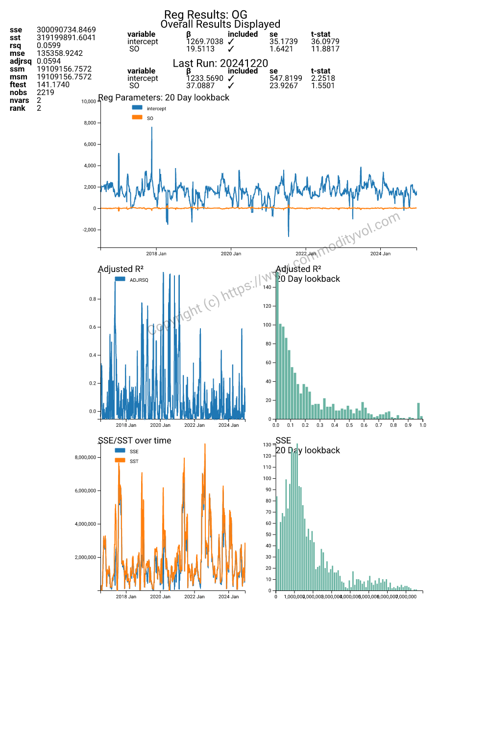
Overall we see a slope coefficient of 19.50! We should just stop here and bask in the warmth of trivial success! We will not. There are a couple of things to notice. First, the regression explains 6% of the variation. Second, note the rather large and statistically significant intercept. The other troubling aspect is the rather large fluctuation in the intercept. There is probably a large constituency that plays the physical ratio game, but it isn’t the whole story.
In returns?
What about returns? Let’s think about what the log differences might look like, theoretically:
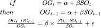
We should expect a very significant regression slope coefficient and no intercept. If we replicate the results above using the log differences in the front month futures prices, here are some of those results.
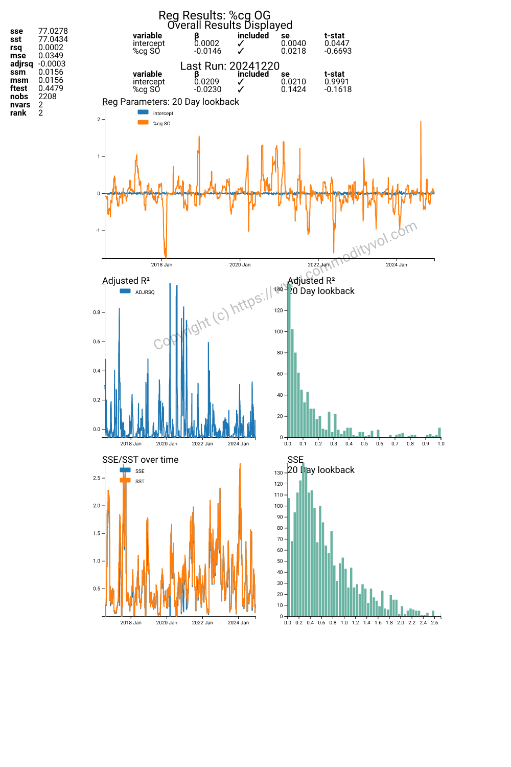
We get partial fulfillment of our supposition. The intercept is very weak and statistical zero. However the beta co e fficient is also zero. Our much hoped for outcome did not survive the log difference. Just for the sake completeness, let’s run a regression on simple price differences and observe what we see.
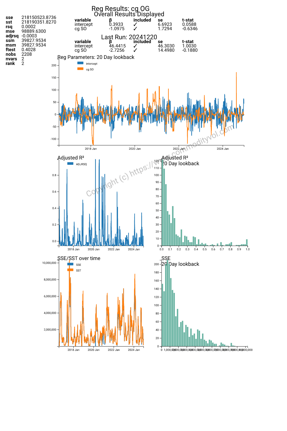
The regression is calamitous! The beta coefficient is the wrong sign. The R squared is also abysmal. The time dynamics are probably much more complicated and so let’s add some lags of bot h gold and silver.
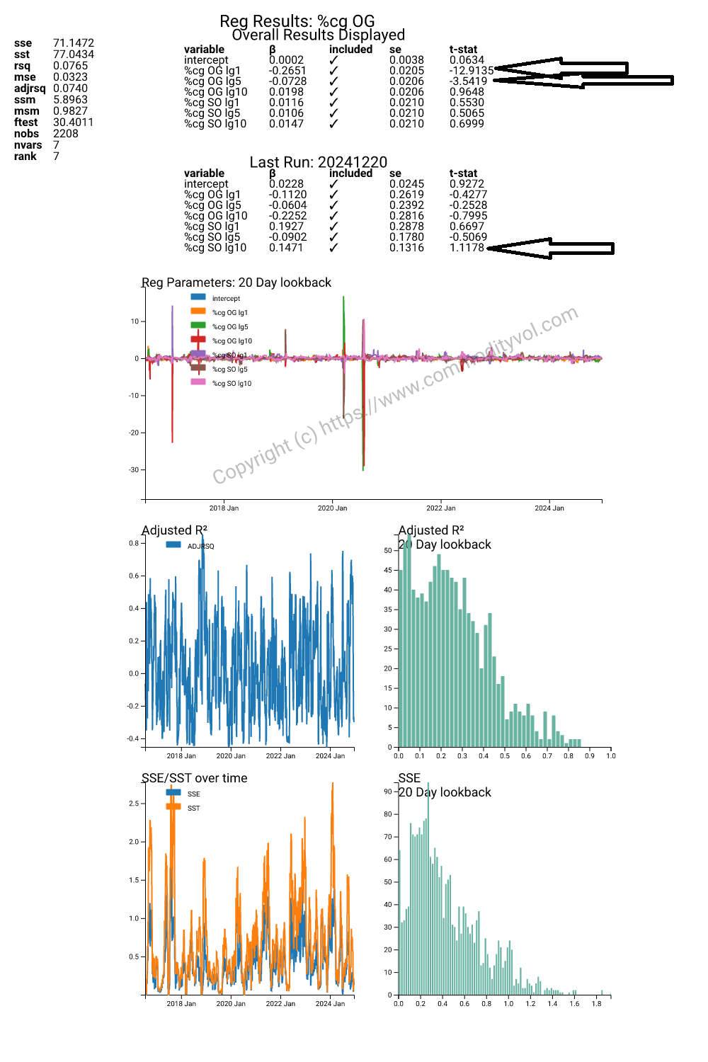
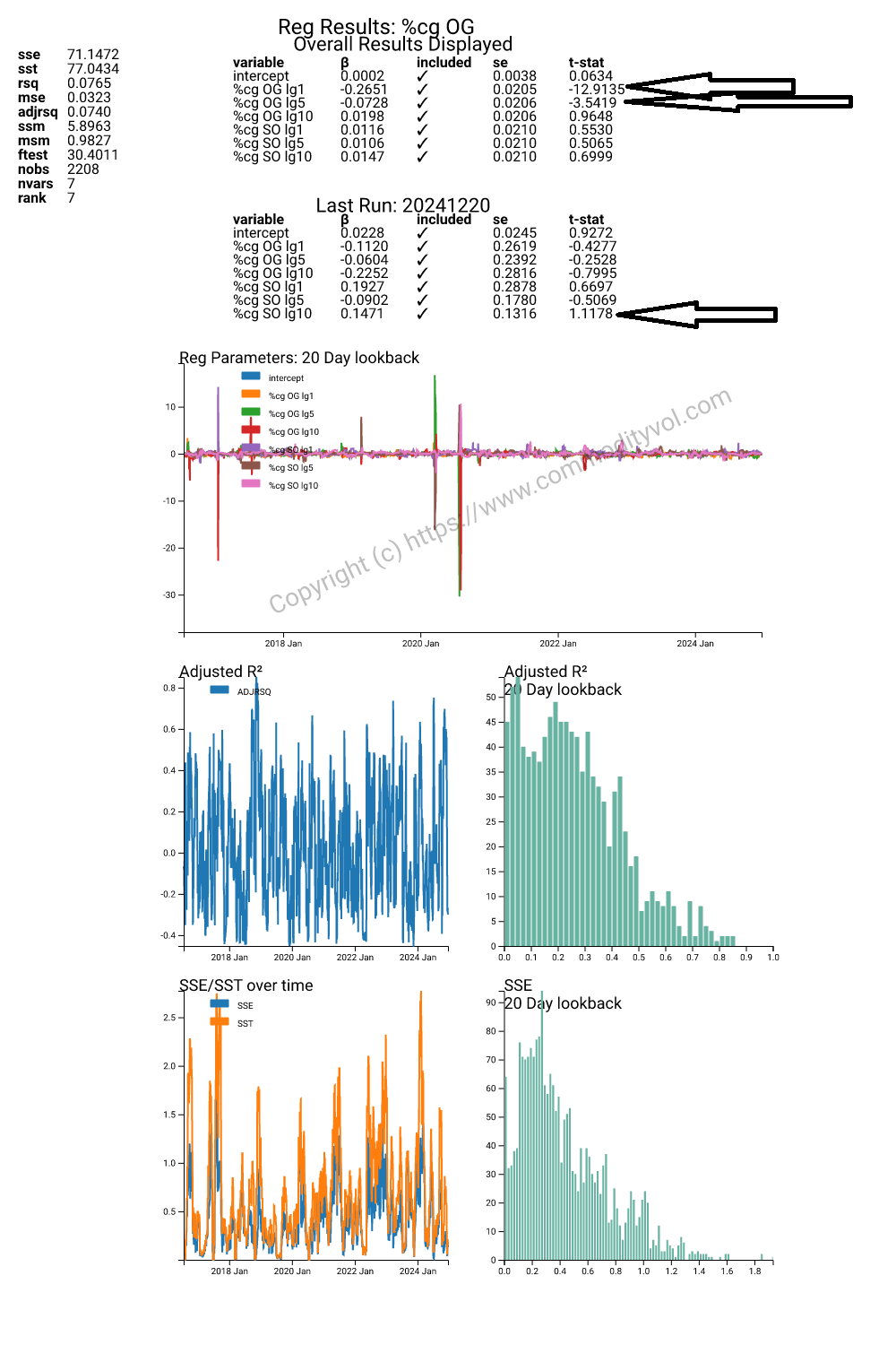
In the long term view, it looks like there is 1 day reversal and 5 day trend that is most active. In the most recent regression, we see that there is some 10 day trending feeding in from silver. The regression is the best across the board, but the R-squared is 7-8%. This is not thrilling, but at least it is the correct direction.
What about vol?
In the first panel look at changes in vol of gold on its lagged realizations. We find an incredible result. The effect is of mean reversion at 1, 5 and 10 day lags. What is interesting is that though the magnitudes are slightly different, the pattern is very similar. The R squared is not enormous, but 6% of the bat is interesting.
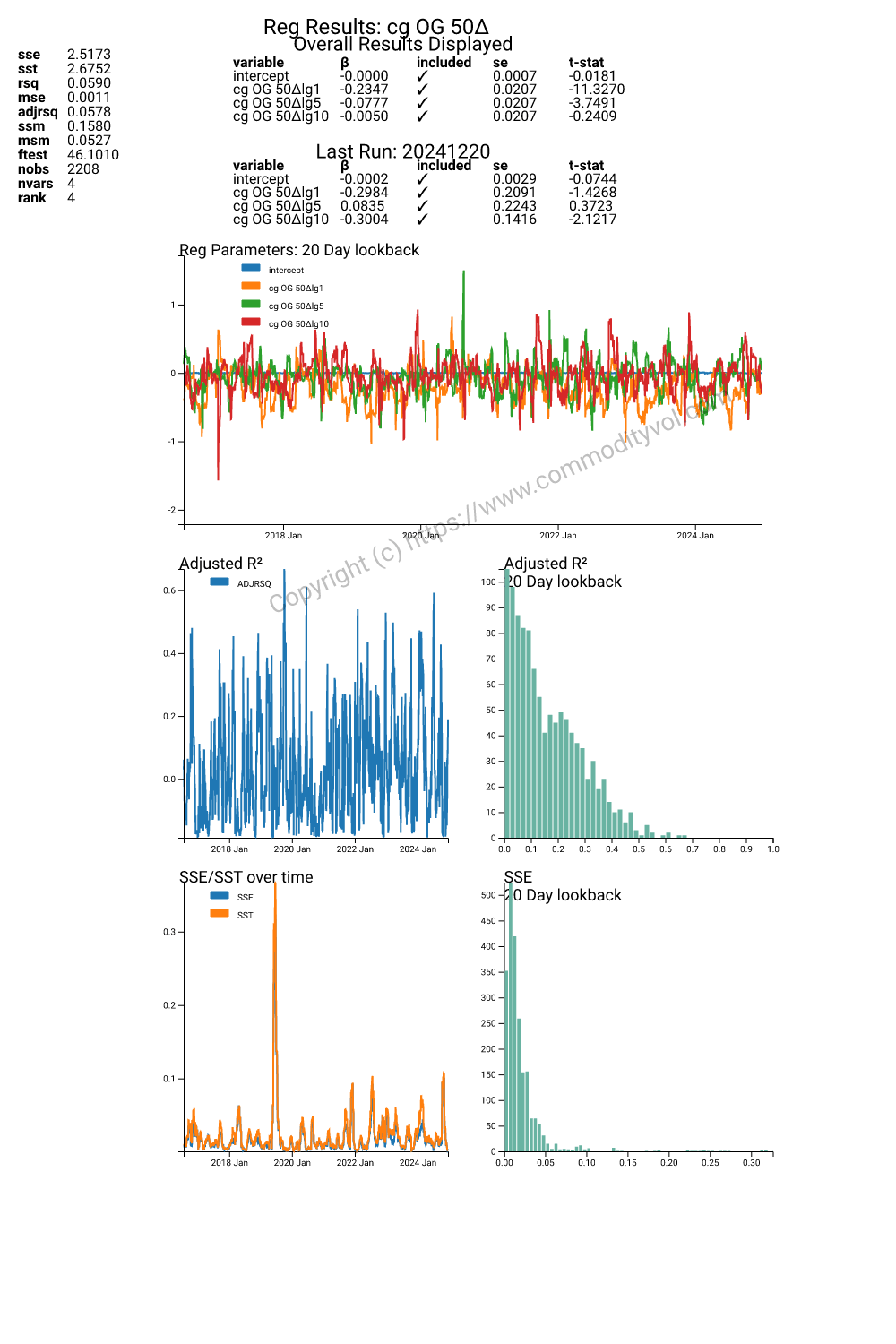
If we include lags of changes in silver vol we see a similar pattern, but also a hin t of feedback from silver vol (changes). This feedback changes sign in the latest run and so must be viewed with some suspicion.
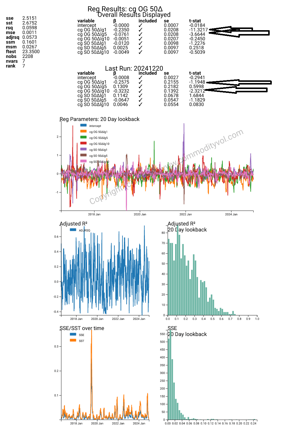
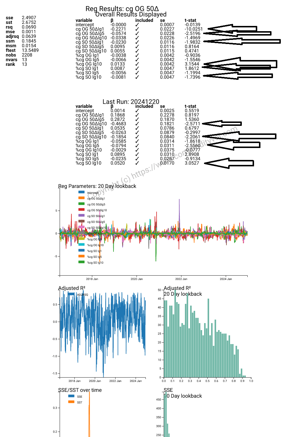
We highlight the statistically significant results. What is interesting is that the results between the latest or last run and the entire period are so different. There are significant regressors in both, but the signs and magnitudes are very different. Looking at the history of the adjusted R squared, we see that sometimes the explanatory power of this variables is less than the penalty of including them. It should not be surprising that market dynamics are not linear and do not follow simple rules.
Conclusion
We began with a conjecture that since there was 19 to 20 times more silver than gold, we should see some relationship like that in the data. Initially, we were surprised to see that in a regression of price against price, 19.5 was discovered. Upon further examination, we see that the results were weak and the regression did not withstand simple transformations.
When we look at changes in the implied vol of the 50 delta option, we found strong reversal pattern. Adding changes in silver vol to the regression did nothing to enhance the explanatory power. It is only when we add the returns of lagged futures returns that we see big changes. First, there is some 10 day effect where increases in price drive vols. There is also some interplay in vols and the lagged returns of silver. The relationships are not superbly strong.